
SXSW Design System
The Project
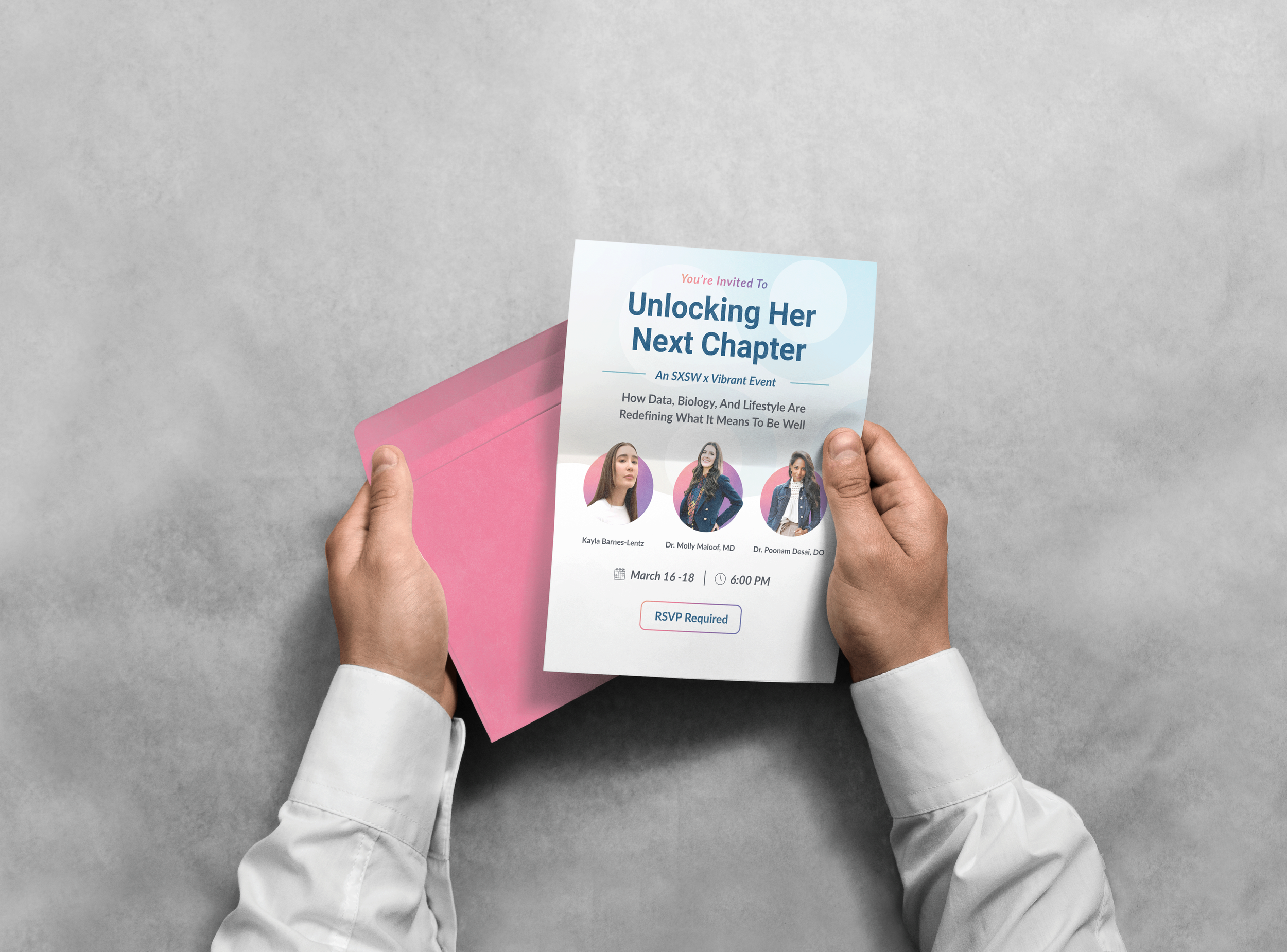
Vibrant Wellness expanded beyond its traditional B2B audience at SXSW, creating an opportunity to connect directly with potential patients. My role was to develop a bright, playful visual direction that felt engaging for SXSW while still remaining recognizable as Vibrant Wellness.
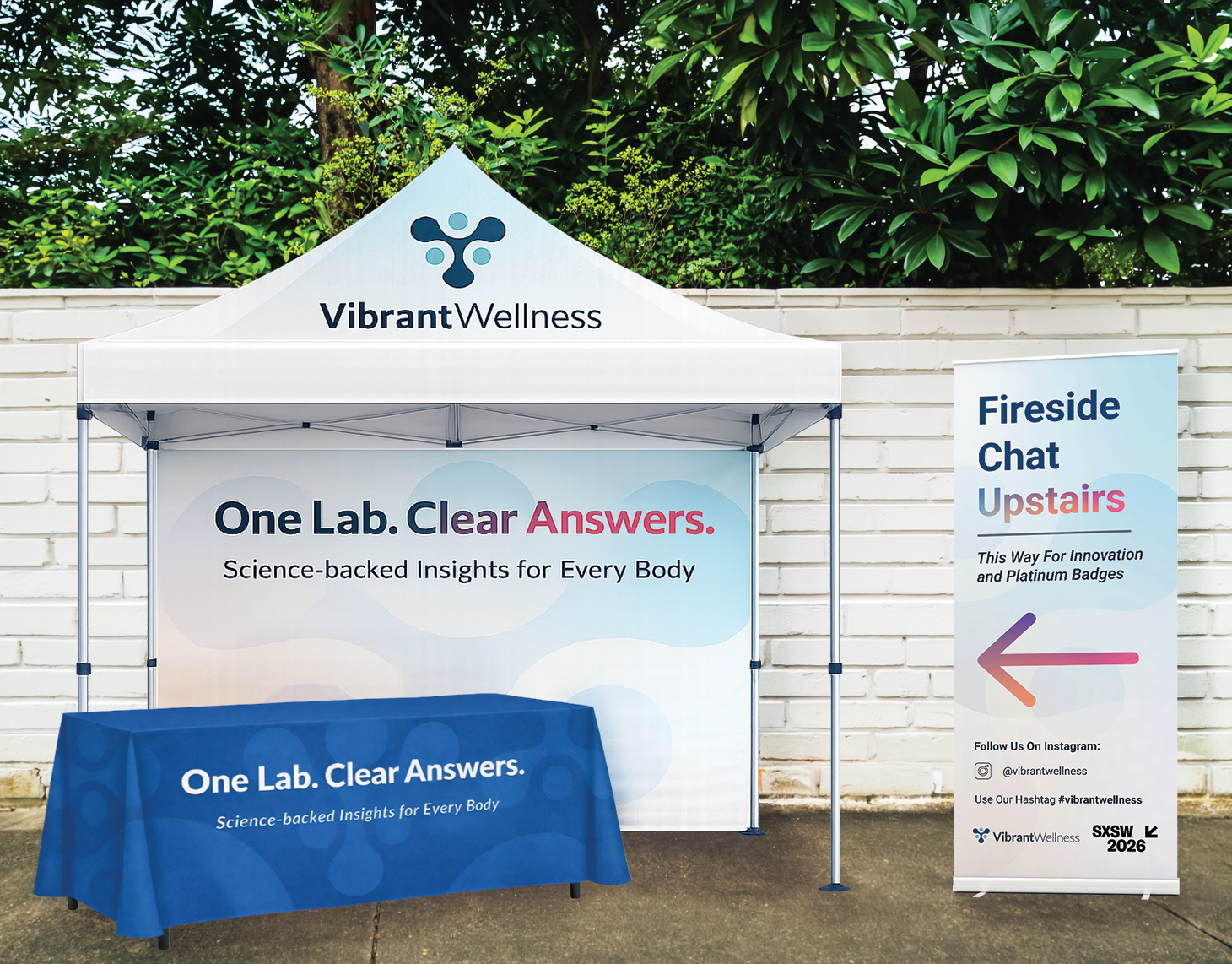
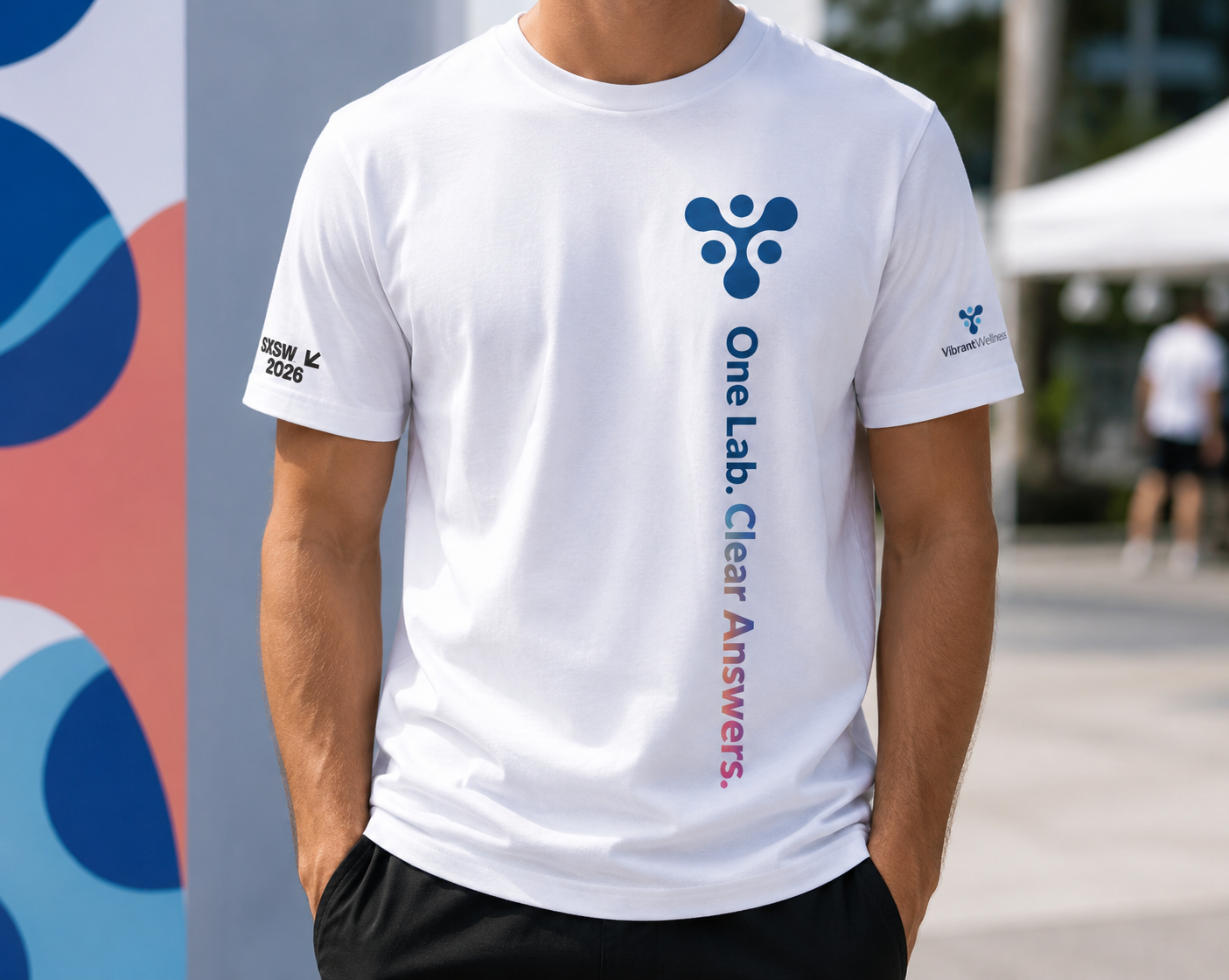
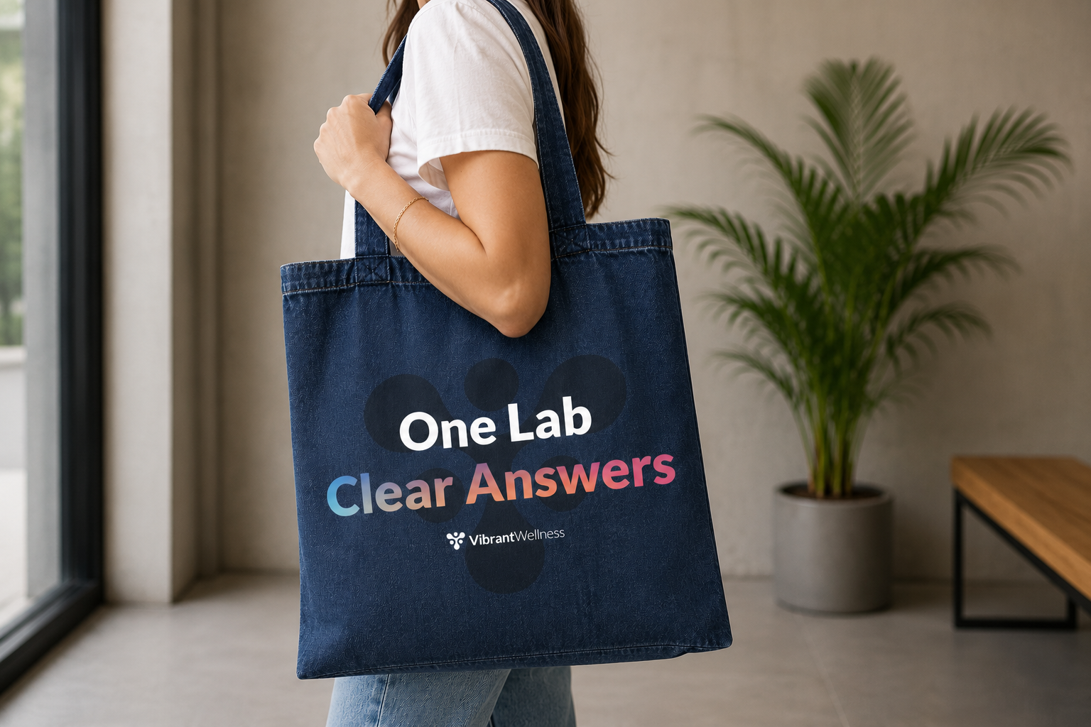
The Approach
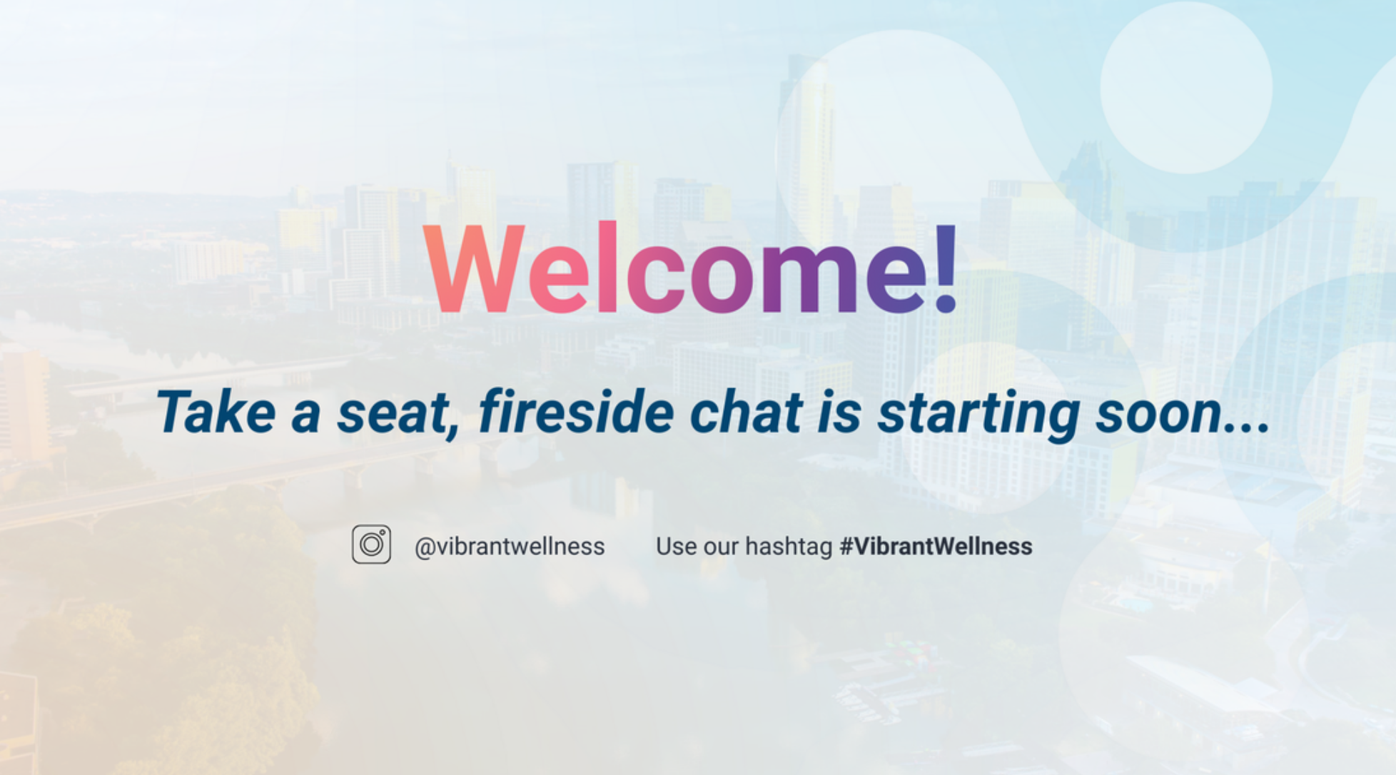
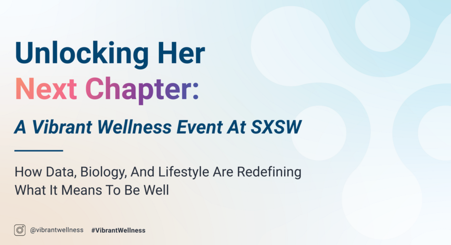
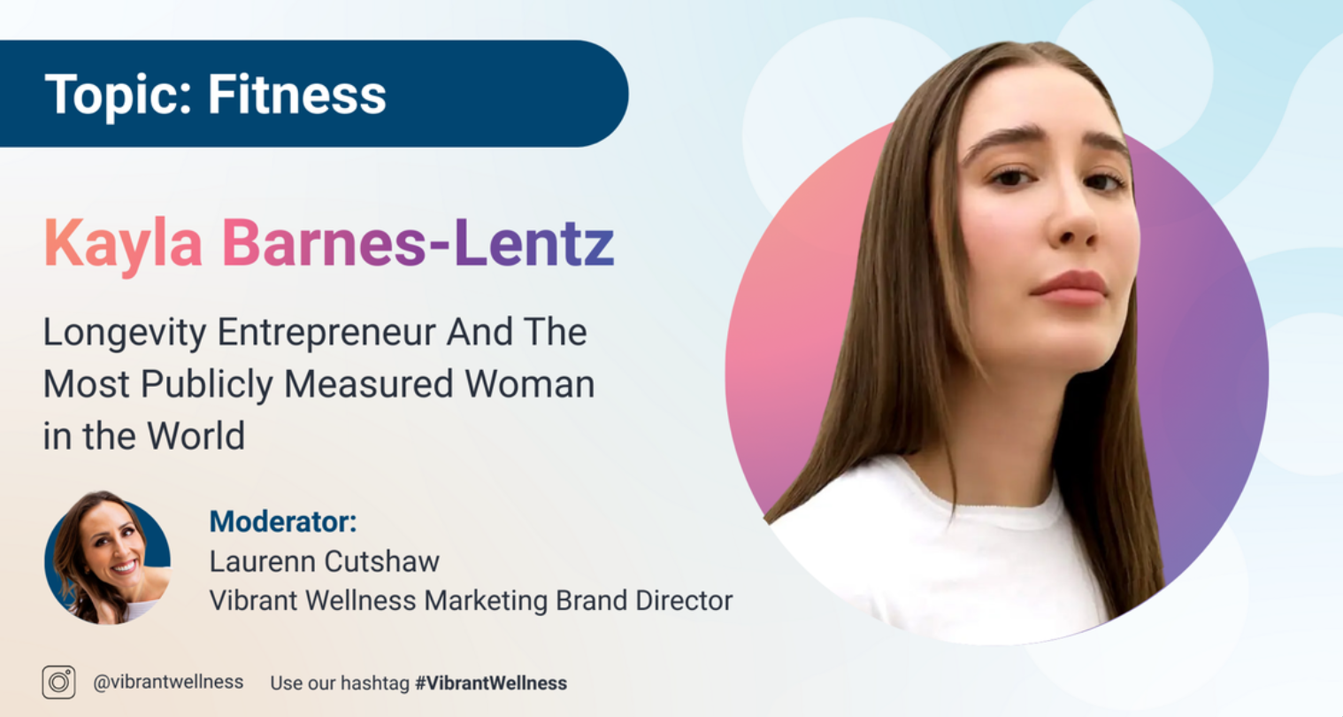
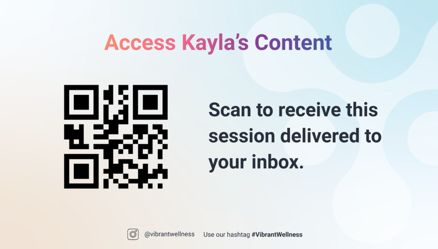
To blend Vibrant Wellness’ established identity with the atmosphere of SXSW, we created a bright, approachable event branding system. We expanded the existing color palette with brighter accents while keeping Vibrant’s signature blue as the visual anchor. Consistent typography, color, and graphics connected each asset into one cohesive experience.
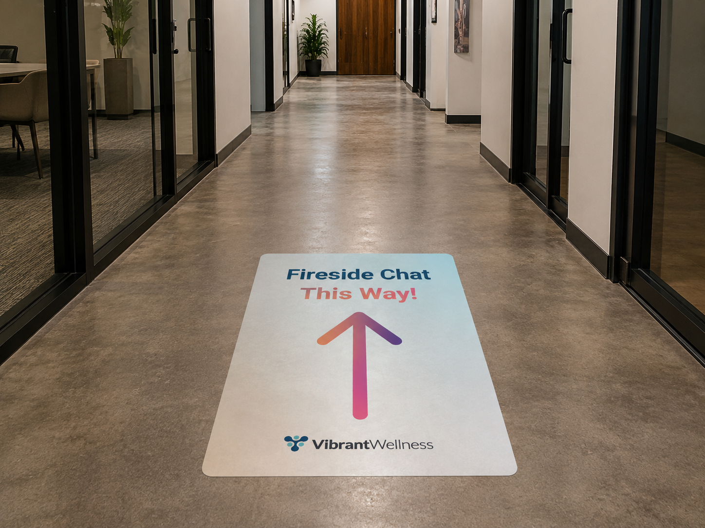
The Impact
The final event experience successfully brought Vibrant Wellness into a consumer-facing environment while staying true to the brand. The system helped Vibrant Wellness stand out at SXSW, creating a more approachable experience that engaged a new audience without losing brand recognition.


Website Layout Pitch
Take a look at the website layout I pitched to the team for SXSW! This concept explored how the event could extend beyond the physical space and create a digital experience that introduced attendees to Vibrant Wellness and its presence at SXSW.